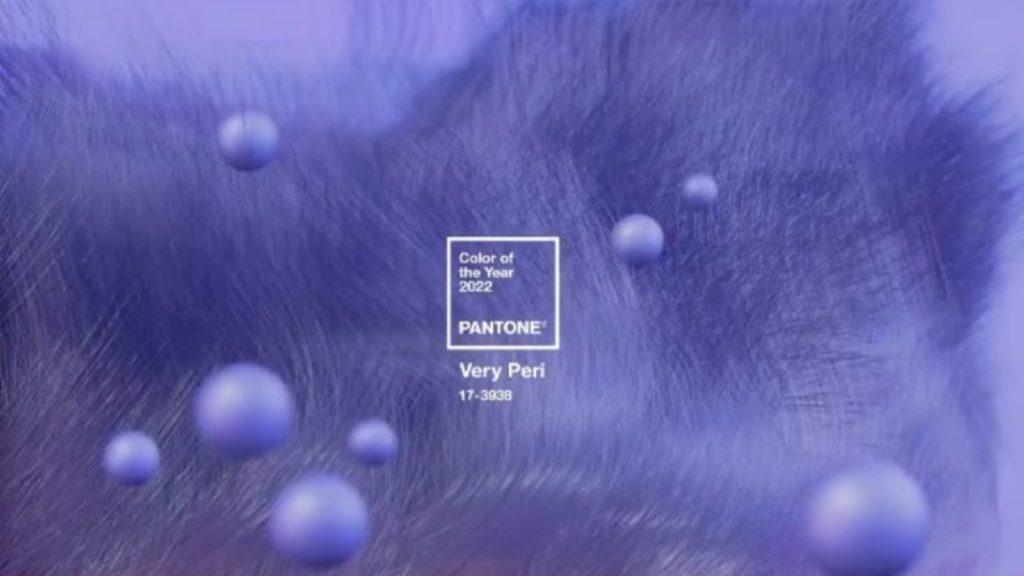
For the first time in the history of the Pantone Colour of the Year, it has created a new colour Very Peri.

It combines violet red undertones and periwinkle blue, which has been created to represent the “transformation of the physical and digital world.”
This transformation has emerged following lockdowns and isolations, which has meant the digital world has a greater role in people’s lives.
Sponsored Video
According to the global source of colour expertise, this shift is in many areas including digital assets such as art and music and the growth of the metaverse.
Executive director of the Pantone Color Institute Leatrice Eiseman commented on Very Peri: “As we move into a world of unprecedented change, the selection of PANTONE 17-3938 Very Peri brings a novel perspective and vision of the trusted and beloved blue colour family.
“Encompassing the qualities of the blues, yet at the same time possessing a violet-red undertone, PANTONE 17-3938 Very Peri displays a spritely, joyous attitude and dynamic presence that encourages courageous creativity and imaginative expression.”
Laurie Pressman, vice president of the Pantone Color Institute, added: “The Pantone Color of the Year reflects what is taking place in our global culture, expressing what people are looking for that colour can hope to answer.
“Creating a new colour for the first time in the history of our Pantone Color of the Year educational colour program reflects the global innovation and transformation taking place.
“As society continues to recognise colour as a critical form of communication and as a way to express and affect ideas and emotions and engage and connect, the complexity of this new red-violet-infused blue hue highlights the expansive possibilities that lie before us.”
It follows on from the Pantone Colour of 2021 which was a pairing of Illuminating and Ultimate Grey.


