Collaborations, colour and creative combinations for greater personalisation were key themes of this year’s ISH exhibition
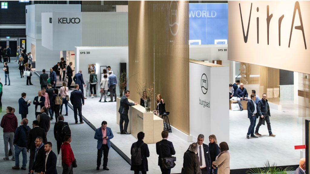
European bathroom show ISH threw open its doors in Frankfurt for five days to unveil the latest trends for the next two years.
Visitors to the show were treated to an array of collaborations from the likes of Roberto Palomba with Ideal Standard and Marcel Wanders with Laufen, through to Jean-Marie Massaud for Axor and Karim Rashid for Glass Deign.
Sponsored Video
In fact, VitrA showcased work by three designers Terri Pecora, Claudio Bellini and Arik Levy.
It was proof positive, if any was needed, the bathroom is an integral part of interior architecture.
And this year, design was expressed through colour, meeting consumer group lifestyles and greater personalisation of products.
All of which could be used to help bathroom designers capture interest and meet wider clients’ demands, through the creation of bespoke bathrooms for residential and hospitality projects.
Colour comeback
For an environment dominated by clinical white sanitaryware and chrome brassware, this year saw a true pop of colour.
Rather than being restricted to furniture frontals, colour was splashed across ceramics, baths and brassware.
Joining earthy tones were heritage pastels, bold tones and dark luxurious finishes.
Ideal Standard and Bette introduced basins in bold choices and an array of pastels, while Dornbracht also introduced these pale candy colours to mixer taps.
These were a welcome contradiction to the vast swathes of dark, industrial brassware finishes of brushed and matt copper, nickel and black, which are now rooted as not only viable but must-have alternatives to the brilliance of chrome.
Greater personalisation
All of which immediately offered designers more choice to cater for a wide array of differing consumer lifestyles.
And this concept of consumer segmentation was showcased on the Roca and Toto stand, which had both created roomsets to appeal to consumers with differing wants, requirements and lifestyle choices.
Now, more than ever, personalisation seemed key for bathroom projects.
Offering customisation through combinations saw designers presented with thousands of possible permutations.
Grohe allowed designers to select and combine brassware colours, handles and inserts, while Kaldewei also presented designers with a choice of shower floor and waste finishes.
And of course to further individualise bathing experiences, digitalisation continued to come through the likes of Hansa Hansgrohe and Dornbracht.
We will be exploring these trends and product highlights from ISH in our two-part review of the show, starting here with designer collaborations.
Palomba Serafini inspired by Ideal Standard’s heritage
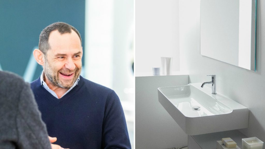
Having recently appointed Roberto Palombo of Palomba Serafini Associati as creative director, working exclusively for Ideal Standard, CEO Torsten Turling spoke of the company’s ambition to “reconquer design leadership”.
He said the company was “connecting back to our strong heritage on design”.
Turling explained: “Ideal Standard has been a true leader in the world of bathroom design for over a century, so we wanted to tap into this history to inform a new wave of design-led solutions.
“We’ve looked back at our iconic designs, analysed their intrinsic value and thought about how to transform them to suit modern society – both in terms of aesthetics and functionality.
It saw the unveiling of its first collaboration with Palomba Serafini Associati, Conca, which will be launched into the UK in 2020.
Based on the original 1972 Conca suite, created by Paolo Tische, Palomba has refined the collection while still staying true to the original characteristics.
The original rounded basin now features a refined squared design to meet contemporary trends.
It also features a round basin, positioned asymmetrically on a square pedestal, which draws inspiration from a suite by Achille Castaglioni.
Roberto Palomba explains why he chose to re-imagine these particular products, stating: “Because they are the symbol of perfection in design.”
Further drawing from Ideal Standard’s heritage, Palomba Serafini Associati reintroduced colour into its sanitaryware offer.
There is a palette of 10 colours, spanning Pomegranate through to Sage and Slate Grey, combining old and new concepts, to complement modern materials such as marble and stone.
It is available on the Ipalyss basin at the end of 2019 and on Conca when it launches.
Roberto Palomba commented: “Looking back, the language of colour has been present in many of Ideal Standard’s designs and has been central to their success.
“Now, we want to introduce colours that revolutionise the way of thinking about the style of the bathroom.”
Combining old and new concepts, was also evident with Palomba Serafini Associati creating two brassware ranges, which could either be used with Conca or any sanitaryware range.
Check features a wide, square design with a flat body and thin handle, while Joy, is a slim, timeless model that comes with a choice of three handles.
Both of the brassware ranges have been created with a 5 litre/min aerator to reduce water usage to meet the needs for water-efficient brassware.
All of the products will sit in a design collection, price positioned above the core Ideal Standard brand and will be extended, with a pipeline of products already planned for the next five years.
Massaud creates Axor jewel”
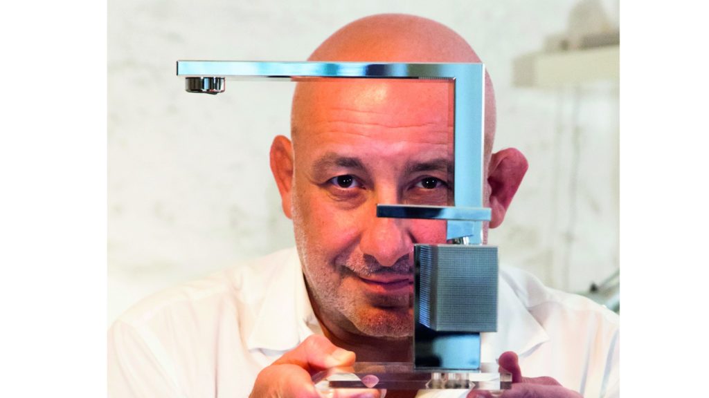
Thirteen years after its first collaboration with Jean-Marie Massaud, Axor unveiled the cubic-styled Edge brassware range.
Manufactured using a diamond-cutting technique, the same tool used in space and laser industries, it has allowed the creation of precise edges and planes.
The Edge collection, for example, features chamfers created at 45°.
Edge is available with a diamond facet etched or polished surface and, for greater choice, it comes in a choice of seven Axor FinishPlus PVD colours.
These span Polished Gold Optic through to Polished Black Chrome.
The Edge collection includes brassware for the washbasin, bathtub, bidet and thermostatic shower modules.
Speaking about the design, Jean-Marie Massaud commented: “In my collaboration with Axor, we always seek to provide a better user experience.
“With Axor Edge, we have answered the demand for refinement and uniqueness to make a sculpture out of an everyday object.
“More than a faucet, each product in the collection is a jewel, a masterpiece, a unique architectural object drilled from a brass block and then dressed with personal finishes.
“A real functional piece of art that shares your intimacy for life – that’s my understanding of luxury.”
New Classic for Laufen by Wanders
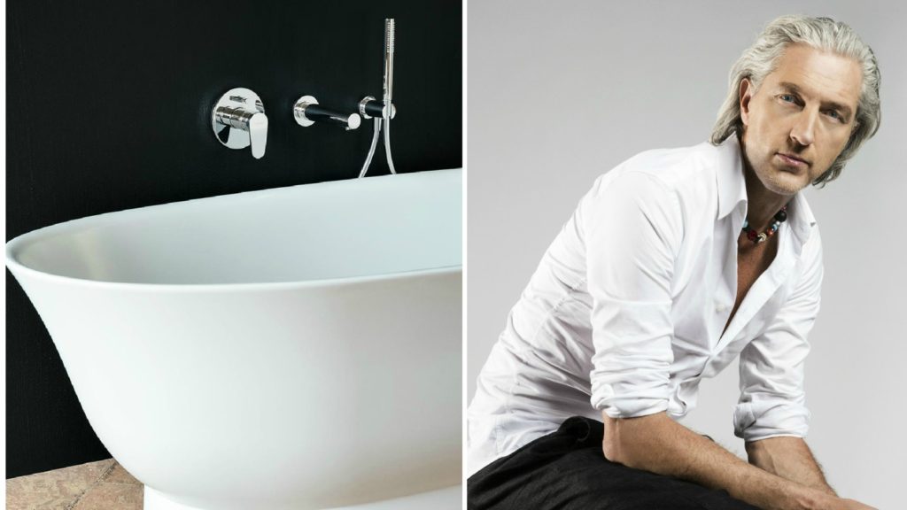
As a result of commissioning Dutch designer Marcel Wanders, Laufen unveiled its New Classic bathroom collection for Laufen.
Wanders used SaphirKeramik to re-interpret Neoclassical sanitaryware shapes.
According to Laufen, it combines a soft, gentle curves of the opening of a flower with angular elements to create design tension.
Marcel Wanders commented on the New Classic: “For the first time, the ultra-modern SaphirKeramik has been moulded into a classic and iconic form.
“This lightweight yet resilient material gave us the unique opportunity to celebrate the beauty of fine porcelain with our elegant, soft lines.”
And such has been the response to the collection, it has already won an iF Design Award for its “sensual combination of aesthetics and function”.
New Classic spans a range of basins from wall-hung to countertop, with 3mm thick walls and integral overflow and outlets.
These are joined by washstands, a choice of rimless WCs, bidet, a freestanding bathtub which measures 1900 x 900mm, furniture, brassware and accessories.
The moulded door furniture comes with optional legs and in a choice of dark real oak veneer, gloss white and matt grey finishes.
And completing the collection is polished chrome brassware for basin, bath, shower and bidet.
In combination, the New Classic collection has been designed to offer a “Bohemian bathing environment with a cosmopolitan urban charm”.
Laufen also revealed its collaboration with Eoos Design with the launch of its pioneering Save WC.
Hansen explores colour with Villeroy & Boch in “His and Hers” concept
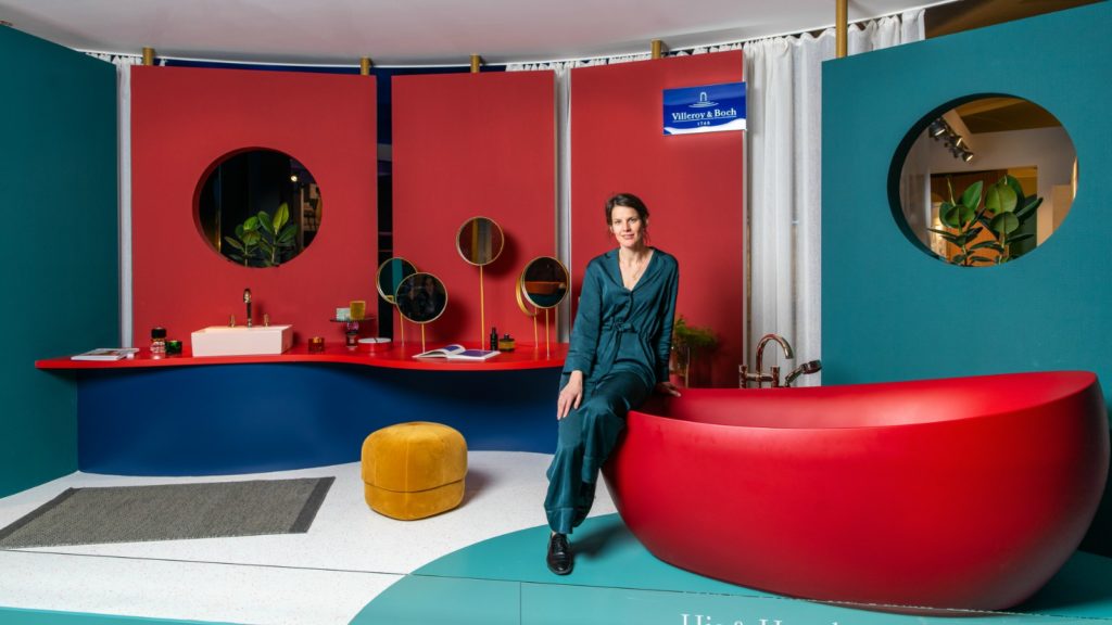
Designer Gesa Hansen developed the His & Hers bathroom concept for Villeroy & Boch, creating two bathrooms that play with the differences between the genders, without creating boundaries.
Without resorting to clichés, Hansen created stagings where composition and intensity of colour account for the differences, with the “Hers” palette being warmer with a boudoir feel and “his” darker with an open and practical design.
Gesa Hansen explained: “Men like bathrooms to be practical and functional. Everything they use on a daily basis needs to be within easy reach…Mod cons are also indispensable in “Hers”.
“However, an atmosphere where she can relax and feel good is important. The bathroom needs to be cosy, natural, comfortable, even a little secretive- yes, diva-like, like a boudoir.
” And because women don’t necessarily want to have their bathroom paraphernalia and cosmetics on display. I focused more on furniture for “Hers”.
The Hers display featured a freestanding Aveo New Generation bath in a bold burgundy to correspond with the Memento 2.0 basin in powder pink.
Whereas the His washing area featured a coral-coloured Memento 2.0 surface-mounted basin with green base unit and dark blue toilet in front of a rust-coloured wall.
Speaking about the concept, Gesa Hansen commented: “For me, the colour concept is a manifestation of individuality.
“Ultimately, it’s not the colours themselves that differentiate between male and female, but rather their composition and dosage.
“I applied all the colours for “His and Hers” extensively and then let them interact with each other to create an effect.”
She concluded the artistic projects, which combined colour concepts with interior design, revealed male and female characteristics: “The colour concepts work for both men and women, there are small differences when it comes to furnishings.
“Nonetheless, for me, His & hers is a call for equality and similarity.”
Sieger Design creates “post-industrial” collection for Duravit
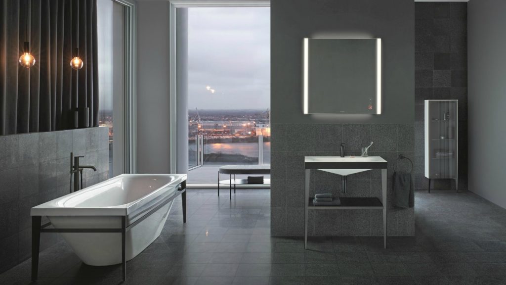
Joining forces once again with Sieger Design, Duravit unveiled Viu ceramic, XViu furniture, with matching bathtubs, which exude forward-looking design.
According to the company “the post-industrial elegance of the pieces emerges from the soft, organic forms with a precise geometry and details finished to a previously unattained level of perfection.
“Sharp contrasts arise from surfaces that combine the finest ceramics, glass and metal with matt lacquers or high quality woods.”
Recurrent design elements and special details are defining elements of the range, which carry across the entire bathroom from washing, bathing and the toilet area, including a frame to reveal ‘exposed’ styling.
Fully glazed from beneath, the Viu washbasins come in five sizes, as well as a handrinse basins.
Their shape follows the design of the c-bonded basin which fits seamlessly into the furniture.
However, basins are available as built-in or above the counter models.
It also comes with a glass shelf which is available in four colours
The washbasins are complemented by furniture doors in a range of real wood, lacquer and décor finishes, including transparent smoked glass for tall and semi-tall cabinets.
And these are complemented by mirrors and mirrored cabinets, with sensor control for dimmable lighting and, in the case of Icon control, this is set into the mirror surface. According to Duravit, this is a first for mirror cabinets.
However, a highlight of the XViu series is the freestanding bathtub, which creates an eye-catching centrepiece.
Available in two sizes 1600 x 800mm and 1800 x 800mm, it features the signature metal frame with v-shaped profile, in Champagne Matt or Black Matt, as a contrast to the white, high gloss acrylic tub.
Claudio Bellini introduces Equal for VitrA
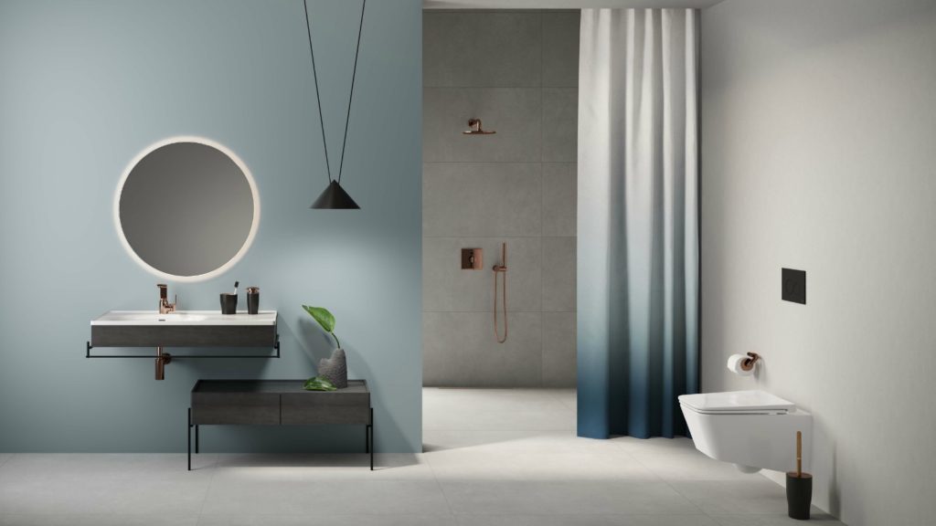
As part of a trio of designer-led collaborations, VitrA unveiled Equal created by Italian architect and designer Claudio Bellini.
According to the company Equal “explored the fusion between the organic shapes found in nature with the architectural lines present in an urban environment.”
The contemporary collection makes use of repeated geometric shapes, with the minimal approach complemented by the monochrome hues and metallic finishes that Bellini has selected.
Using smooth edges, the ceramic has been designed to mimic the natural cavities found in lakes, alongside structured lines to ground the aesthetic.
These defined structures echo those found in modernist architecture
Designed for residential and hospitality environments, Equal established a consistent flow through the bathroom with the use of sleek metal rails and fine lines, connecting each piece to the next.
The fine lines of the furniture are reflected in the washbasins and through to the mirrors, which are available in three sizes.
Speaking about the collection, design director of VitrA Erdem Akan said: “Through this partnership with Claudio Bellini, VitrA were able to approach bathroom furniture from a new, architectural perspective.
“Focusing on structure and shape, we were able to explore innovative design concepts that have developed into a stylish and functional collection.”

