Open-plan or broken plan? Philippa Turrell looks at how designers should approach the creation of a large-scale kitchen space.
First there came open-plan kitchens, the coveted spaces opening up an entire ground floor into a singular working and socialising space.
Barriers, such as doors and walls, were removed to create a seamless area and, along with them, so was the privacy of all users sharing the same space.
Sponsored Video
Enter the revised open plan kitchen – open plan 2.0 – or the broken plan kitchen, which although shares the same philosophy, sees the slight return of division through design, using structure and more defined areas.
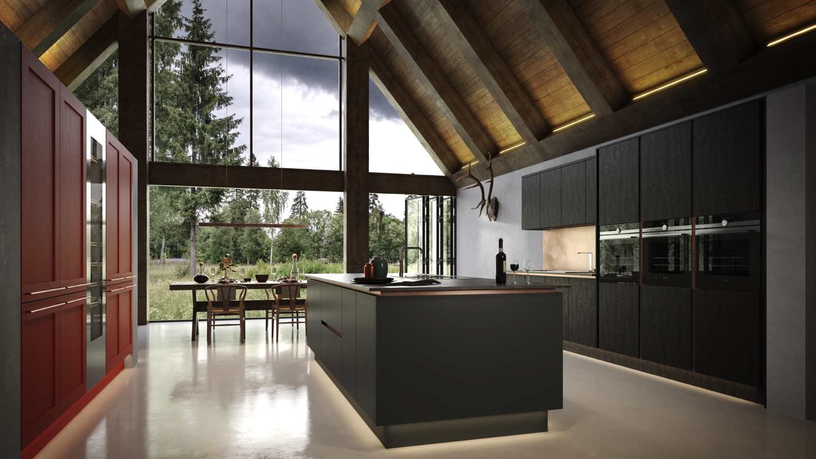
Kesseler – Large spaces can cater for open-plan looks, such as the Vanquish open-plan kitchen in Aura wood-grained laminate. Texture has been combined with colour on the opposing wall, with handled furniture
Commercial manager of Keller Kitchens UK Rob van Steen offers the definition: “A broken plan kitchen retains all the positive aspects of open-plan kitchens, such as light and openness, but it also provides zones which create privacy should it be needed.”
And digital marketing executive Aaron O’Neill of BA Components agrees, commenting: “The new broken-plan trend helps to avoid the negatives of the design while still allowing you to enjoy the benefits of how light and open your living area is.”
It could be argued that this isn’t a new trend, as it just a natural extension of the open-plan design.
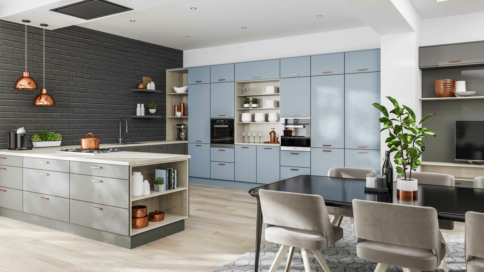
Faith Furniture Company – Combining Dust Grey and Denim finishes is Lastra, part of LochAnna Kitchens, which uses colour, shelves and open units to create a broken plan kitchen. Designers can choose from six finishes, which are either smooth matt or textured grain
In fact, Regional sales manager of South West & Wales for Nolte Eddie Streader comments: “Broken-plan kitchens are really a trend that has been created recently by giving a name to an existing style statement.”
However, with the introduction of open shelving and dividers, such as metal framed units associated with in vogue ‘industrial’ interiors, it has given rise to a greater focus on broken plan kitchens.
Distinct by design
The island unit remains a firm fixture in both the open plan and broken plan kitchen.
Not only is it an aesthetic architectural statement but it acts as a practical room division offering storage, concealing plumbing and electrics while providing a casual eating area.
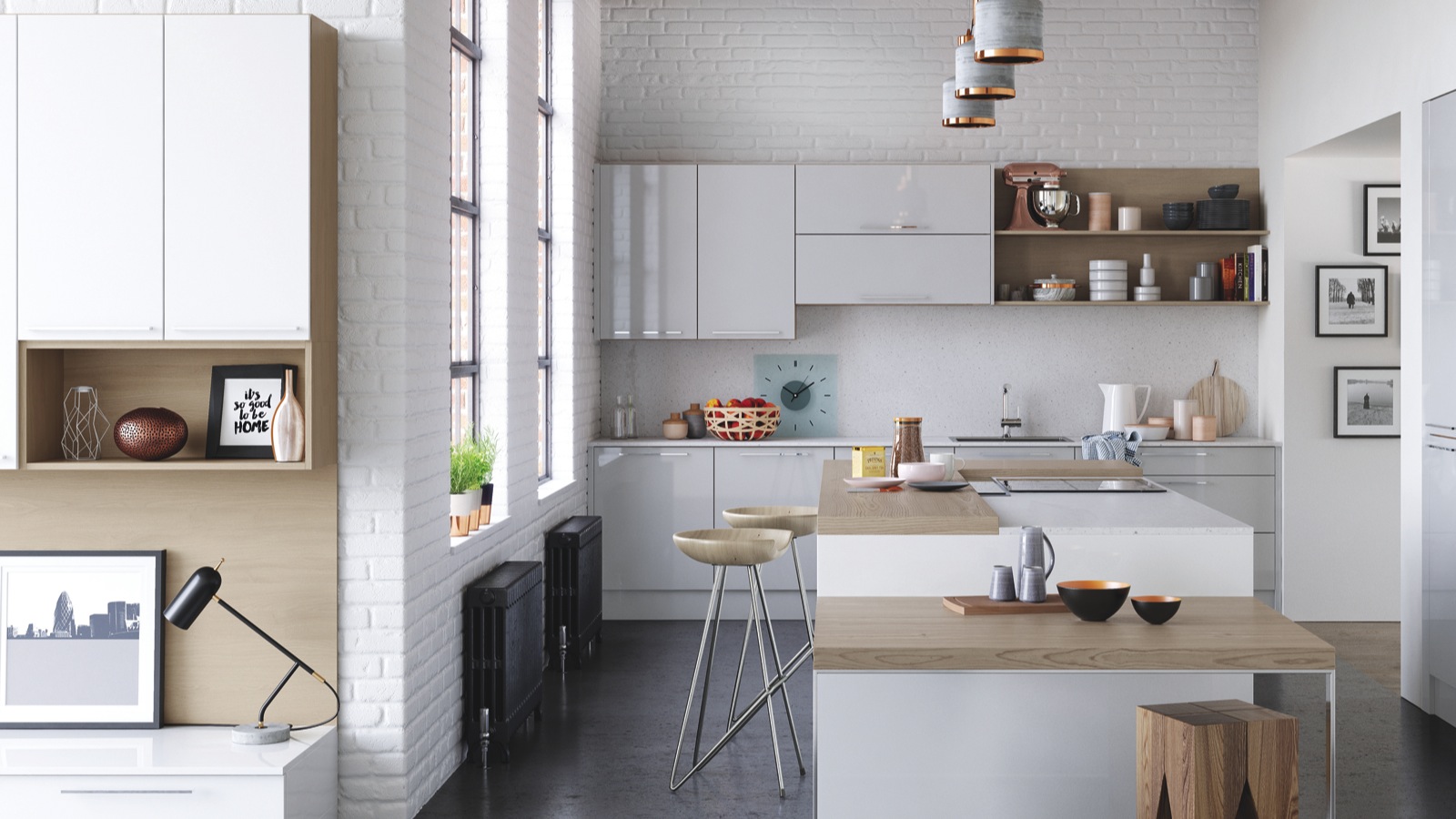
Caple – Darga is a high gloss, polyurethane slab kitchen which comes in a choice of seven frontal finishes and five carcase colours. It uses split heights to demarcate a casual eating area and open shelving in a contrasting material
But the broken plan kitchen relies on more than a monolithic slab to create definition. Softer physical barriers such as open-plan shelving and half-walls are also coming into play.
But, importantly, it also make use of visual or mental barriers, as Aaron O’Neill of BA Components explains: “Zoning your space with structural elements such as shelves and half-walls to physically divide the area, or changing levels to add a mental divide between cooking and dining areas, helps to give everything their separate space while also staying knitted together.”
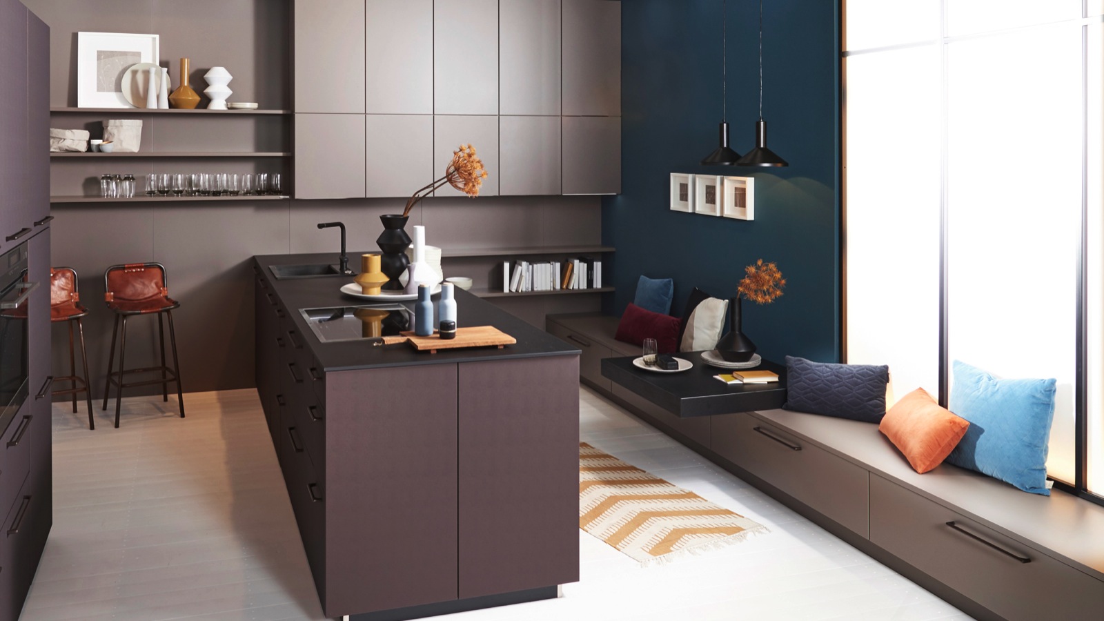
Nolte – Using Nappa in leather effect Brazilian Brown with Soft Lack in matt lacquer, this kitchen creates cooking and living areas which are distinct and yet form part of a cohesive scheme. The peninsula is used as a dividing element, with low units and 100mm worktop used as a seating area
Design manager of Moores Neil McDonald agrees and offers even more details: “Distinct areas can be created by the use of different floor finishes, differences in floor levels and floating freestanding partitions, such as bookcases or a screen.
“This means that it is still possible to achieve the spacious feel that open-plan living provides but creates a separation so that people can have their own space away from each other.”
Colours and textures
And the broken plan look can be achieved whether using classical or contemporary looks, or furniture that combines the two.
In fact, combining colours and textures, as well as levels, helps to create definition between distinct zones of use.
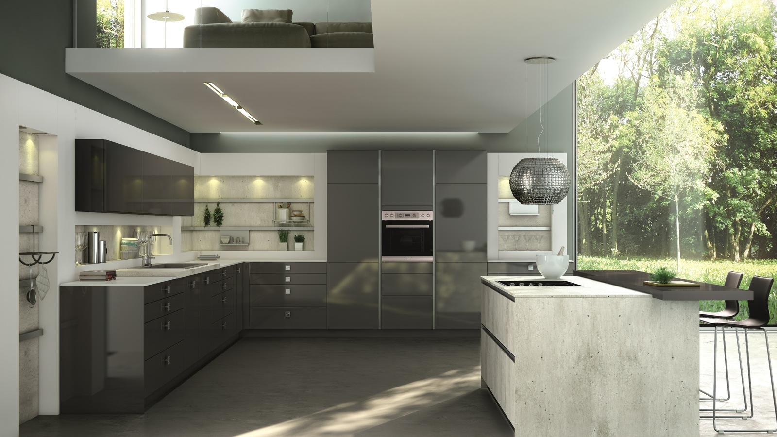
Stormer – Como is pictured in a high gloss Nero Grey with contrasting island in Madrid textured wood effect to create a slight broken scheme. Como is available in nine high gloss shades and Madrid in eight wood and stone effects
Head of UK operations at Rotpunkt Matt Phillips confirms: “Varying tone and texture across the worktops and furniture has become the latest trend for defining certain areas in the kitchen, contrasting different styles of décor and finish.”
And Virtu product manager Charlotte Mornay agrees: “Mixing gloss or matt effect lacquered doors with woodgrains, metals, stones and splashes of colour will all help to create contrast and break up cabinetry.”
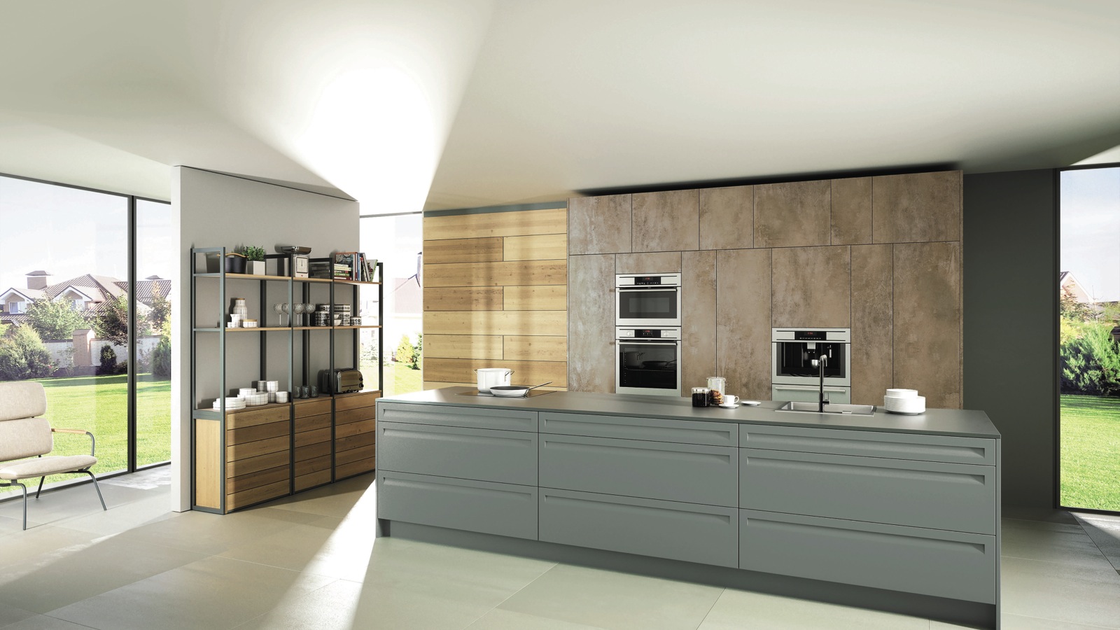
Rotpunkt – Influenced by the industrial trend is this Iron Corten Steel and Informa Verde kitchen, which is combined with a Memory Old Wild Oak display unit with black metal trim. Mixing materials and textures, designers can choose from 100 door styles in 100 colours with 26 carcase decors
In fact, commercial director of Kesseler Scott Slater states his clients favour three points of contrast, and he adds: “A large kitchen can easily carry off contrasting treatment for the island and wall run; perhaps solid colour on one and textured neutrals on the other, with signature items as well as a stand-out appliance.”
In the pink
And offering a soft visual point of contrast, against neutrals of white, cream and grey, plus wooden tones, has been a splash of pink.
Commercial sales director at Masterclass Kitchens Steve Tough says: “We are seeing much more in the way of vibrant and bold colours being used in the kitchen, with pink definitely being among them.”
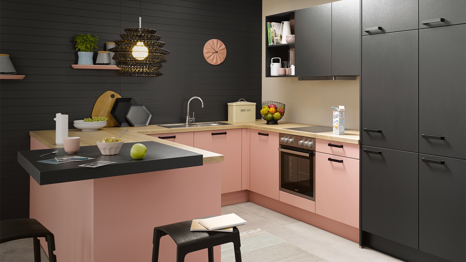
Schuller – Biella is shown in Pastel Rose Satin and is combined with a dark wood unit and light wood worktop, combining colours and textures to create zones. It also uses open units, shelving and different height surfaces
While managing director of InHouse Wayne Dance believes pink is of significant importance, as he comments: “The art of great kitchen design lies in the clever use of colour and finish to create definition and purpose.
“Pastel pink is a great addition to kitchen designers’ palettes, with chalky pastel tones taking the functional feel down a notch, creating a relaxed sociable feel.
“In busy multi-functional spaces, the smallest detail will stand out, pink is a great choice for defining without dominance.”
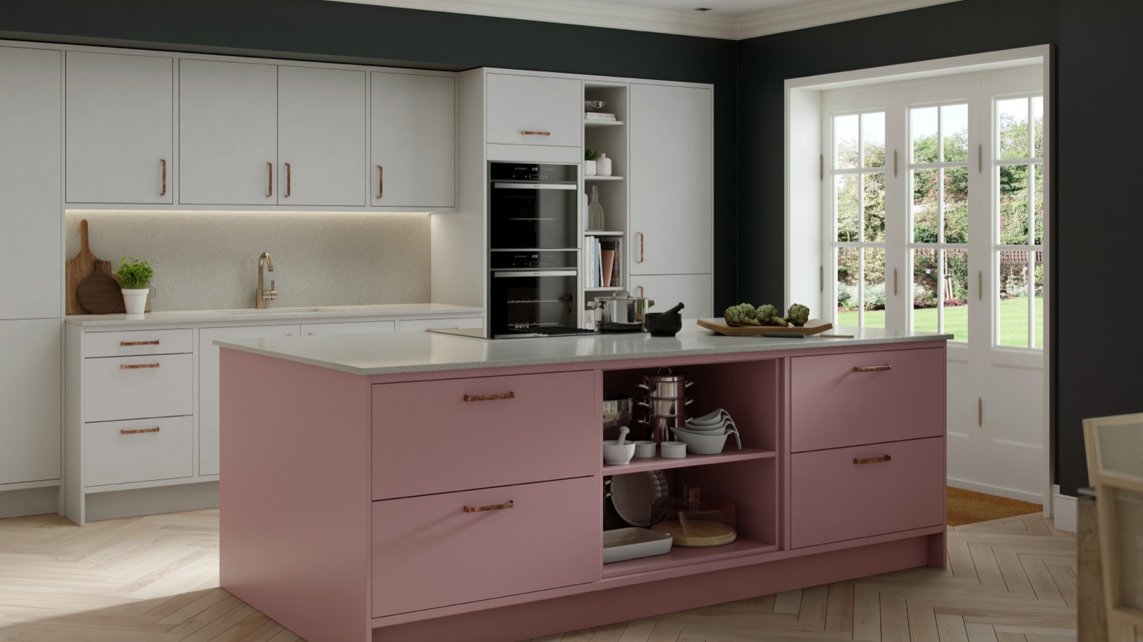
Masterclass Kitchens – Making the island a focal point of this broken plan Hampton kitchen is the Vintage Rose finish, with open shelving. Hampton is a smooth painted slab door which comes in a choice of 27 colours
His view is reiterated by Aaron O’Neill: “An influence of pink can bring a warm, uplifting feel to the kitchen.”
The biggest challenge
Although a large space offers great flexibility in terms of colour and unit choice, industry experts also suggest this can be the greatest challenge for kitchen designers.
Rob van Steen of Keller Kitchens UK adds: “The larger kitchen poses the greatest difficulty as designers need to keep in mind the bigger ‘open-plan’ picture so as not to end up with a space that looks like several different rooms.”
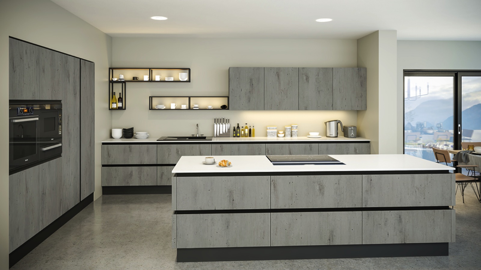
BA Components – Part of the Bella collection is the Venice kitchen, shown in a London Concrete finish. Playing to the industrial theme, it uses open framed units to create a visual break in the run of wall units
And experts warn that designers must equally consider the functionality, as much as the aesthetics, just as they would in a smaller room.
“With a greater amount of space comes great responsibility,” says Aaron O’Neill of BA Components, adding: “The difficulty with larger kitchens is making sure that there is a flow to how the kitchen will be used on a day-to-day basis.
“It’s harder to ensure every space is essential, where there is an abundance of choice in terms of what you can fit in.”
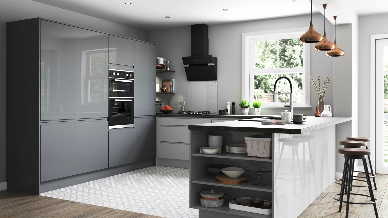
PJH – Hanover forms part of the Virtu kitchen range, which allows designers to create interconnected spaces, such as the open shelving making the transition to living space. Manufactured with a 22mm thick door with J handle, the furniture comes in Dust Grey Gloss and Light Grey Gloss
His view is reiterated by Eddie Streader of Nolte who comments: “Larger rooms can be tempting in terms of having so much freedom to put more in.
“Now it would be a mistake to think that larger rooms sort themselves out just become of more space; it is in fact the opposite.”
And he adds: “The working triangle is not obsolete just because living is now part of the picture.”
Large scale longevity
Certainly, there’s no sign of the trend for larger, open plan schemes abating. Despite the UK having the smallest kitchens in Europe in new build homes; it is quite the reverse for those designers working in the refurbishment market.
Scott Slater of Kesseler points out: “Naturally, houses are getting smaller in the new build sector; however, our sales are very often part of a project where a client is making the kitchen a larger space in their existing home.
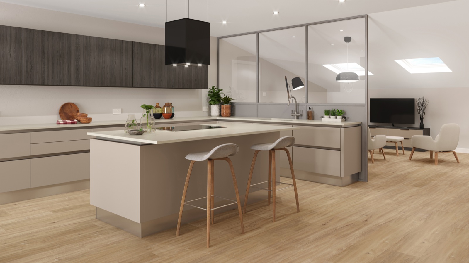
Crown Imperial – The Zeluso kitchen is shown in two tones, with Black Oak wall and Coffee Light base units for a mix and match contemporary look. This super matt kitchen is available in 11 neutral colours and four woods
“So, we’re seeing people actively seek larger kitchen in the same house. We’re expecting to see a similar trend going forward.”
And Rob van Steen points out this is reflected in his company’s sales figures: “Keller sells a bigger proportion of larger lifestyle kitchens to the UK market than we do across Europe, and we currently do not predict this proportion to change.”
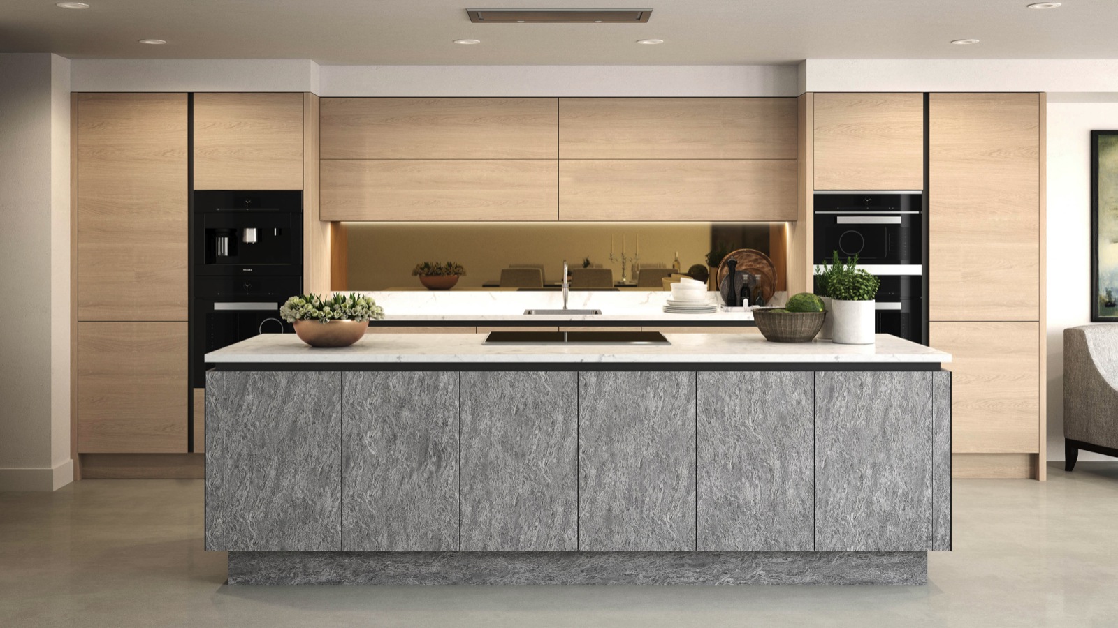
Daval – The Langham kitchen furniture range combines an island in Basalt Stone, together with a Varenna blonde wood backdrop. It visually defines the zones in the kitchen, following the rules of open plan 2.0
So, take a look at how a kitchen project can use both physical and aesthetical barriers to distinguish and differentiate areas, in a subtly unified space.
Consider colour, contrasting textures and cabinet styles to create functional and fashionable broken plan kitchens, as it’s not just about open shelving, and half-walls!
For another feature like this, check out our exploration of the importance of cabinetry in our bathrooms.

