For the second year running, Regal Kitchens scooped Best Use of Website at the Hafele Studio Partner Awards. So who better to ask advice about developing or enhancing a retailer’s online presence? Senior designer John Martin tells us all about the secret of its online success.
This successful retail business has been established for nine years and owns two showrooms, with a studio in Billericay, as well as one in Chelmsford.
It is the only independent kitchen company in Essex to have been awarded FIRA (Furniture Industry Research Association) Gold Award for Installation and has also won the Excellent Customer Service category in the Essex Business Awards.
Sponsored Video
All that and it is a Which? Trusted Trader too! So, senior designer of Regal Kitchens John Martin tells us what it takes to be winning online.
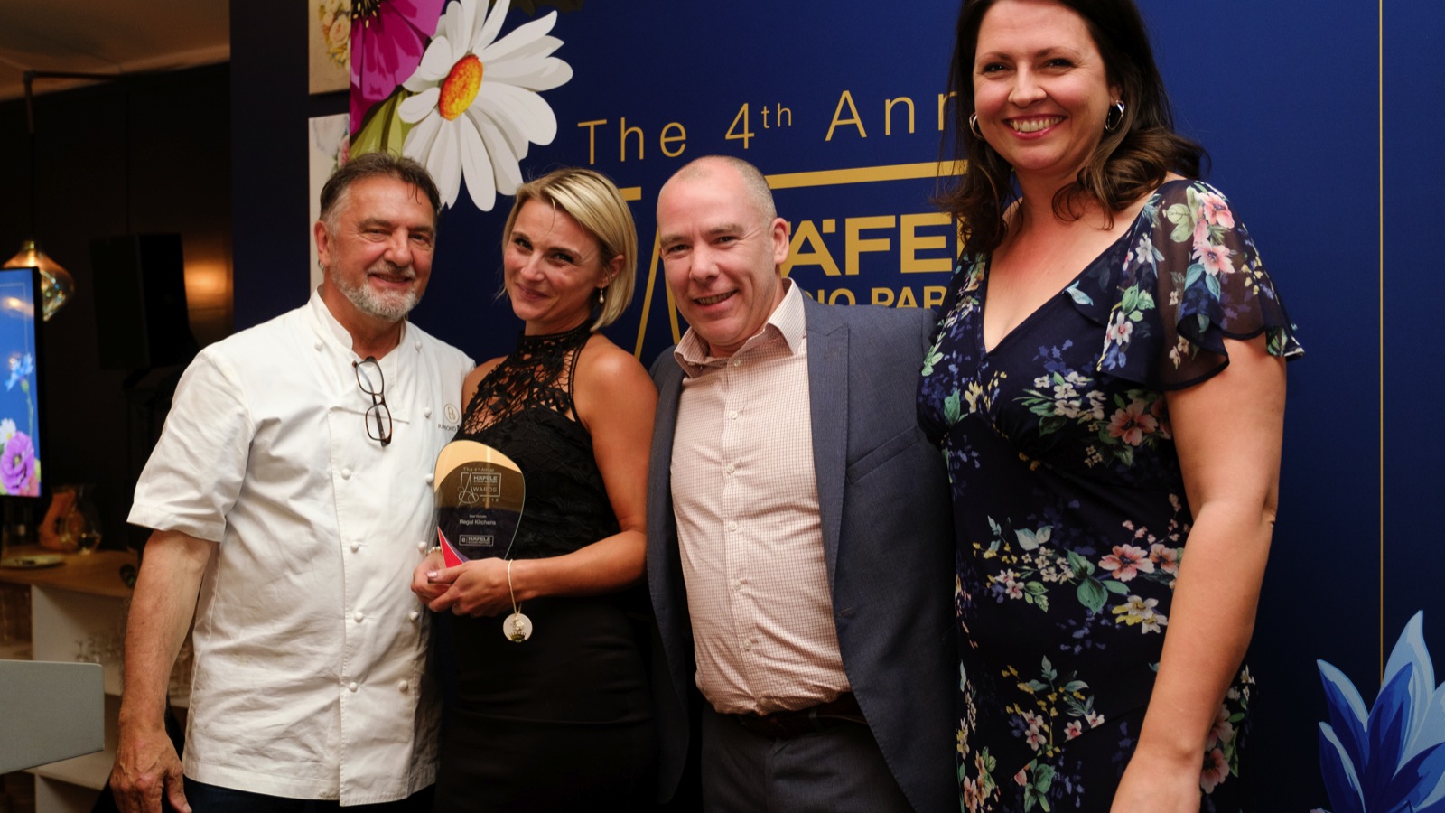
Regal Kitchens scooped the Best Use of Website Award at the fourth annual Hafele Studio Partner Awards. The trophy was presented by chef Raymond Blanc, OBE, and marketing director Chloe Thacker
Q: When did you first produce a website for your business?
A: We started the company in 2009 and one of the first jobs was designing the website. It’s an essential element of any business now, let alone one in the retail world.
Customers want an immediate impression of your brand values and service quality – as well as the opportunity to view stock in the comfort of their home.
Q: Is the current site reflective of your website when you first started out online? If not, how has it evolved?
A: It is completely different. The site has been completely overhauled three times and is now updated on a monthly basis. A website cannot be an afterthought or a ‘nice to have’. It’s your shop-window, and keeping the look and feel up-to-date is essential.
Q: What has been the biggest change to your website?
A: The biggest change was when mobile devices overtook desktop computers as the preferred means of web browsing. Many websites were caught out – and continue to be caught out – by only working on one sort of screen-size.
We knew that our site had to become more phone-friendly in order to be convenient to customers and browsers. So, our website is mobile responsive.
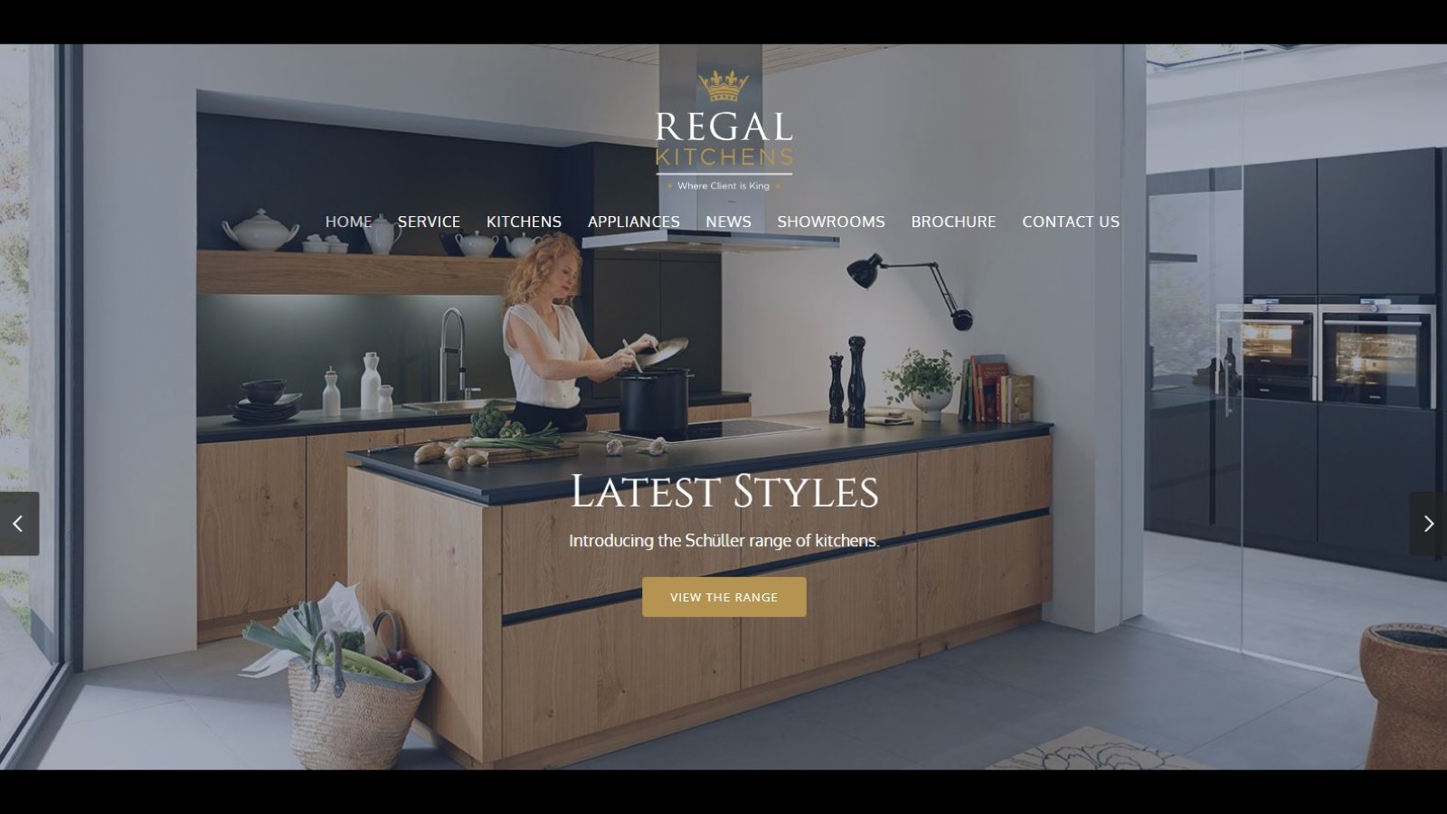
The website is designed to establish its credentials with consumers, then drive them into the store. It has been optimised for use with tablets and smart phones
Q: Have you had any input/advice from suppliers such as Hafele?
A: We rely on our suppliers for up-to-date information, and we have recently started linking Hafele’s videos to our YouTube site. Hafele’s marketing is very strong so there is a great synergy between the brands. It produces great visuals and promotional ideas, so it makes sense to use as much as possible.
Q: What is the aim of your website and how does the design, content and usability reflect this?
A: Like all of our marketing, it is designed to drive people into our showroom. The site is clear and easy to use, allowing people to navigate quickly.
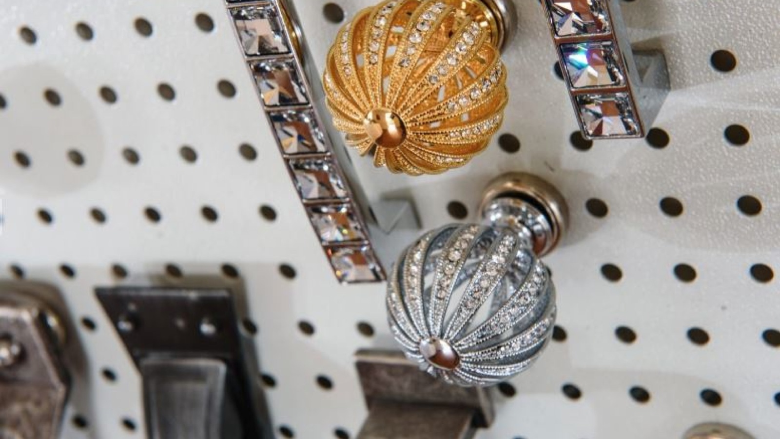
But it is also designed to provide inspiration through the use of stunning photography. We want to show how paying attention to details, such as the right taps and handles, can create extraordinary finishes.
We also give potential buyers a detailed step-by-step guide to the design process they can expect. It’s important to offer clarity and transparency throughout every stage of the process. We also have a news section which highlights the events and work that we do within the community.
We’re proud of where we are and we want to give a little back through things such as cookery demonstrations and design workshops. In fact, we are running a design workshop in partnership with Hafele for South Essex University Design students in October.
Q: What work has been done behind the scenes to make your website cut through, such as SEO?
A: Because of the length of time we have been trading we are generally near the top of searches, but we do also pay for Google-Ads to support this positioning. A little effort and attention to this kind of promotion is really worthwhile.
Regal Kitchens has recently started linking Hafele’s videos to its YouTube site, providing greater synergy between the brands
Q: What is the most important area of your website and why?
A: We try to involve clients in the whole process at the earliest opportunity and we have downloadable guides on our site so potential customers can quickly get up to speed about our solutions and our way of working.
Q: How important is the website as part of your overall marketing mix and how does the website work alongside your social media channels?
A: It plays a major role in establishing our credentials and is the foundation of our approach. There is no more powerful way of reaching customers and prospects, and our showroom team and designers work hand-in-hand to create the right impression.
From the site, users are able to reach the seven other social media sites we post to. Social media can be incredibly useful – but it is important to commit to it; allowing channels to go dormant is never a good look.
Q: Do you have a dedicated person for the role?
A: Emma Mcloughlin is our marketing manager. She works very closely with our independent website designer and our brand specialist to ensure continuity of message and design across the web.
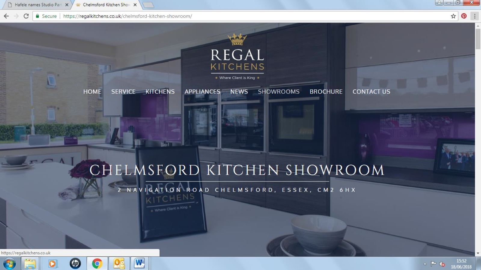
The website has been designed to reflect the brand values and imagery of its showrooms. This is through the use of photography, including paying attention to details such as handles
Q: How do you measure the success of the website?
A: We gather statistics around page visits and dwell time. We also take the time to ask every client about the process that led to their interacting with Regal Kitchens, particularly if it results in a sale.
Q: How do you plan to evolve your website?
A: We fall back on the tested CANI formula (Continuous and Never-ending Improvement) across the entire business. When it comes to the website, any improvement must be aligned with usability. It is tempting to continuously tweak and modify, but the ultimate aim is to have a site that is simple to use and inspirational to browse.
Q: What advice would you give to independent kitchen and bathroom retailers who want to improve their website offer?
A: Until you think you’re spending too much time and money on your website, you’re probably not spending enough. Take it seriously – it shouldn’t be an afterthought.
Our website has been a great leveller in helping us compete with the nationwide brands. Try to look at your own site to see what improvements can be made.
Is it easy to navigate? Does your brand identity come across? Are you showcasing products and solutions in the best possible light? Any time and effort spent on these considerations will be well worth it on the long run.
Regal Kitchens weren’t the only winners at the Hafele Studio Partner Awards, check out our report of the winners in full.

