Adamsons celebrates 40 years with new brand and showroom
As it approaches its 40th anniversary in September, home transformation specialist Adamsons has launched a new brand identity and showroom.
As it approaches its 40th anniversary in September, home transformation specialist Adamsons has launched a new brand identity and showroom.

According to the Tameside-based retailer, the new branding was driven by a need to modernise the company’s look and feel, while staying true to the values that have built its reputation over the past four decades.
Central to the rebrand is a new value proposition and clearer brand messaging, reflecting Adamsons’ commitment to creativity, quality, innovation, and reliability.
Sponsored Video
It includes an overhaul of Adamsons’ visual identity, including a new logo and colour scheme, as well as a refreshed 4,300 sqft showroom and shop front in Dunkinfield.
The company’s signature yellow colour scheme, central to Adamsons’ identity, remains a key part of the new look, blending tradition with a modern twist.

Adamsons’ digital presence has also been revamped with a new website, designed for improved user experience, easier navigation, clearer messaging, and engaging content.
All marketing materials, including brochures, business cards, social media graphics, and advertisements, have also been updated.
The rebrand was delivered by Darke Creative for the brand design and Ambos Digital for the new website.
Managing director of Adamsons Rachel Moors said: “Reaching our 40th year is a significant milestone, and we felt it was the right moment to look forward and embrace change.
“This rebrand is not just about updating our image; it’s about reaffirming our commitment to our customers.
“We believe in creativity, innovation and continuous improvement, and this new identity reflects our vision for the future.”
Adamsons recently appointed two new colleagues, with additions to its design and marketing teams.
Related Articles
#socialwall
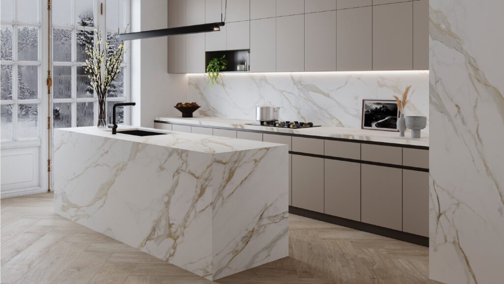
Sintered stone manufacturer Neolith has launched Calacatta Roma and Cappadocia Sunset, inspired by nature and classical architecture, and for use in kitchens or bathrooms walls, floors, in gardens or facades.

They belong to The New Classtone and Fusioncollections which interpret marble and natural stone, respectively, and boast Neolith’s antibacterial NeolEAT technology.
Inspired by Ancient Rome, Calacatta Roma (pictured top) pays homage to Italian Carrara marble, with ochre and grey veins in a white background.
While the Cappadocia region, in central Turkey, with its rock formations formed by volcanoes and underground cities, has inspired Cappadocia Sunset (pictured below).

Just like all of Neolith’s surfaces, Calacatta Roma and Cappadocia Sunset are resistant to heat and atmospheric conditions, are 100% recyclable, and do not contain added quartz to their formulation.
Mar 14, 2024
JUST OUT: @AcquabellaBath has unveiled a choice of shower grate patterns for its Base and Arq shower trays… https://t.co/kMN83c40Qf
JUST OUT: @FrankeUK unveils Mythos single lever mixers in Swivel Spout and Pull-out Nozzle options. #kitchendesign https://t.co/TSKCAo5r0e
INTERVIEW: Sales and marketing director of @blumuk David Sanders on how the kitchen industry has changed post-pand… https://t.co/k9LIpUhhDF
NEWS: Challenging housing market is driving home improvements, finds new research by @HafeleUK #HomeImprovement… https://t.co/eMB7jludIm
NEWS: British manufacturer @kudosshowersltd acquired by European SanSwiss. #acquisition #manufacturers #bathrooms https://t.co/gpOv7jMevn
NEWS: @HafeleUK announces Richard Curtis as managing director. #newhire #appointment #leadership https://t.co/NP8U5ramOb
NEWS: @officialbikbbi names CT1 sealant manufacturer as corporate sponsor. #installation #installer https://t.co/8zsxs2HI3n
NEWS: @quookeruk named one of fastest-growing companies in North West. #business #Awards https://t.co/9zZ1ZDGrFI
RETAILER FOCUS: Managing director and design director of UK Kitchen Retailer of the Year @KitchensbyJSG Jim Geddes… https://t.co/JhL3vmxwbd
NEWS: Consumers are renovating for long term, with kitchens and bathrooms a priority, finds @HouzzUK… https://t.co/9VhoTUDI0B
PROFILE: Managing Director of Flair Showers Alan Wright talks about the relaunch of the company, creation of a Show… https://t.co/WDMPqDt2Uk
The new @blumuk carbon black LEGRABOX boasts beautifully slim drawer sides, bringing furniture onto trend, easily b… https://t.co/DrEXXWTyQb
NEWS: House of Fraser owner @FrasersGroupPLC enters strategic partnership with @ao, buying a stake in the online e… https://t.co/44N0O9bekn
NEWS: @HowdensJoinery awarded @WhichUK Best Buy for its rigid cabinets and handleless kitchens. #kitchen… https://t.co/rALz8XRHbv
NEWS: @grohe invites 800 guests from around the world to its Grohe X Professional event in Lisbon, Portugal.… https://t.co/2RGjDum980
JUST OUT: Home appliance brand Candy has unveiled the Rapido dishwasher, claimed to be the fastest and most spaciou… https://t.co/mbWn2pJp2C
Newsletter
Sign up to receive our newsletter and we’ll send you details of our latest videos, competitions and much more

