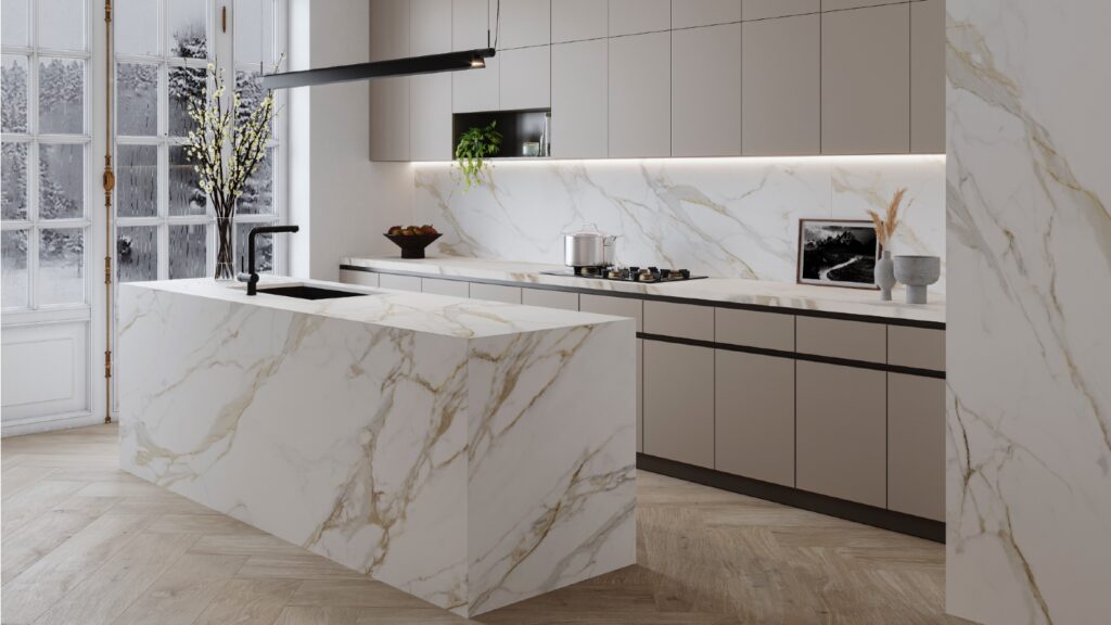
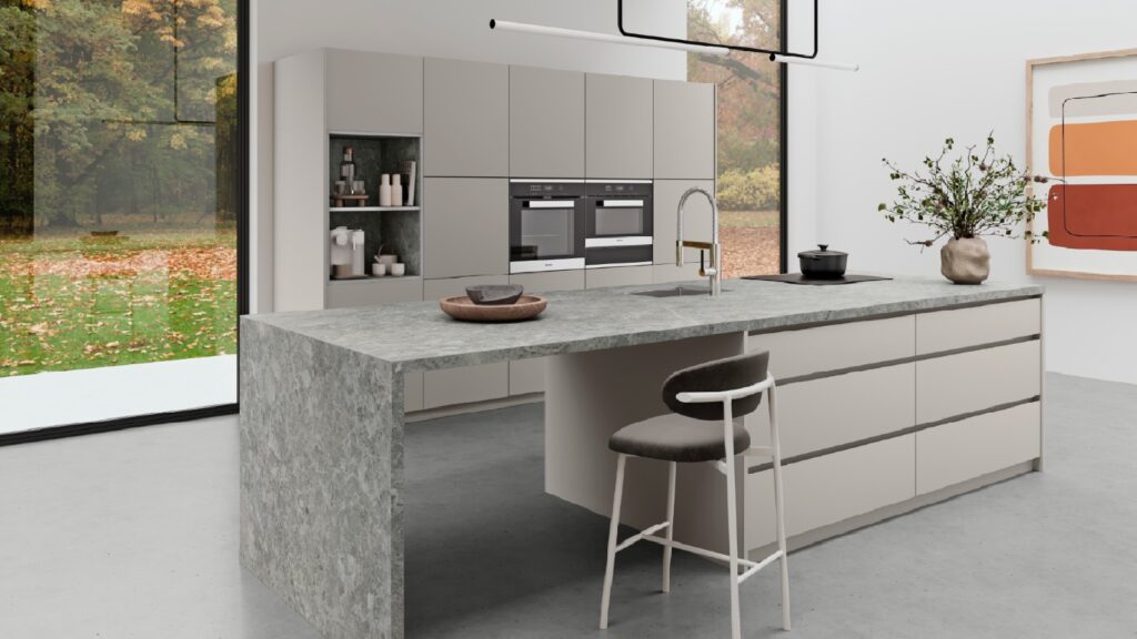
Kitchen sink, tap and home appliance manufacturer Franke has unveiled a new look and brand identity.

It has been designed to reflect its brand promise “Franke transforms change into opportunities for a better living.”
The brand identity has been created to be “dynamic, flexible and contemporary”, with the updated logo in a “Vibrant Red” tone, an evolution of the current colour.
Sponsored Video
In addition, the Antartica font has been chosen to convey the message of constant change.
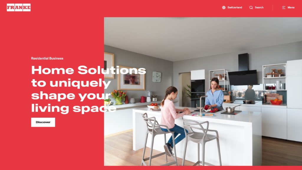
Featuring on all marketing communication, the revised brand identity will also be featured on the company’s new website, which has been more than six months in development.
The responsive website has been created to have clear information architecture, so users can find out information on the Franke Group, as well as its products and services.
CEO of the Franke Group Patrik Wohlhauser commented: “The new branding is more than just an updated look for the Franke Group: We relish change and see it as an opportunity to innovate and to keep improving. That’s why we refined our brand positioning and why we’re open to change.
“We boldly push the boundaries and drive forward innovations, so that we are always one step ahead. Day in, day out, we strive to present the best possible ideas and solutions to respond to our customers’ ever-changing needs. Our new design is a clear expression of this ambition.”
Franke has recently re-entered the UK kitchen appliance market, with the company citing the opportunity has been provided by a new business division and a market beset by supply issues.


