Projects | Japandi-style kitchen wins Kbsa Designer Award
Showroom manager of Bauen Design Hollie Clark scooped Kbsa Designer Award for Kitchens (£25k-£50k) for a Japandi themed project
Showroom manager of Bauen Design Hollie Clark scooped Kbsa Designer Award for Kitchens (£25k-£50k) for a Japandi themed project

Inspired by a teapot from her husband’s travel to Japan, Hollie Clark’s design-led client requested a Japandi-style kitchen for her new home.
The light and bright scheme was for an open plan extension to a Victorian home, which already had plenty of natural light.
Sponsored Video
Creating a kitchen space, without it appearing clinical was among the design challenges.
Material choice
The kitchen could only be designed against two walls in the room but the client wanted it to look different from the previous design.

The hob was originally positioned against the back wall, which Hollie moved to an island position.
She then considered the Japandi aesthetic. “I wanted to achieve a light and bright look, without necessarily using white doors, which can become quite stark and sterile”, says Hollie, adding “so choosing the right materials and finishes was a starting point.”
The client had seen a light grey door in the Bauen Design showroom and Hollie actually combined two doors to create visual interest in the simplistic kitchen design.
She used a handleless door and one with a bronze frame and handle.
The client was interested in marble, so Hollie looked to Dekton which offered the same aesthetics but which is more durable for the kitchen.
In addition, she added an accent Walnut bi-fold door to conceal a breakfast station, which all brought warmth to the scheme.
It complemented the Herringbone parquet flooring, which the client had already chosen.
However, Hollie was keen to avoid the use of too much wood, as the original kitchen was a timber design.
So she opted for an injection of the wood instead: “I think it can be easy to overdesign something but, actually, what makes it so beautiful is the simplicity of it.
Simple structures
The design was broken up with simple structures, such as a bulkhead, wall-length splashback with shelf and a worktop which was thick at one side of the breakfast bar and thin at the other.

“Just the simple detail of building the splashback out to create a shelf at the top, it formed a nice place to display pieces including her Japanese teapot’.
Hollie also brought texture into the room by tiling above the shelf.
However, a key element of the design was fluting on the island, which offers movement and brings gentle texture into the room.
Constructed from a mineral decorative wall panel, the installer fitted it to make it appear seamless beneath the breakfast bar.
“In the showroom, we had just started using this new material called FitWall. I just loved it and the client loved it as well.
“She really didn’t want a design that somebody else had, so it was really important for us to bring in new finishes and new things that we maybe hadn’t used before.”
New ideas
In fact, Hollie says her favourite part of the kitchen project was working with the new finishes, particularly the Fitwall. While she said the client’s favourite part was the overall aesthetic.
She concluded: “Design-led, light and bright and bringing in those Japanese and Scandi aspects, it just all came together and she just loved the overall look”.
Related Articles
#socialwall
Sintered stone manufacturer Neolith has launched Calacatta Roma and Cappadocia Sunset, inspired by nature and classical architecture, and for use in kitchens or bathrooms walls, floors, in gardens or facades.

They belong to The New Classtone and Fusioncollections which interpret marble and natural stone, respectively, and boast Neolith’s antibacterial NeolEAT technology.
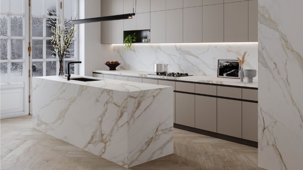
Inspired by Ancient Rome, Calacatta Roma (pictured top) pays homage to Italian Carrara marble, with ochre and grey veins in a white background.
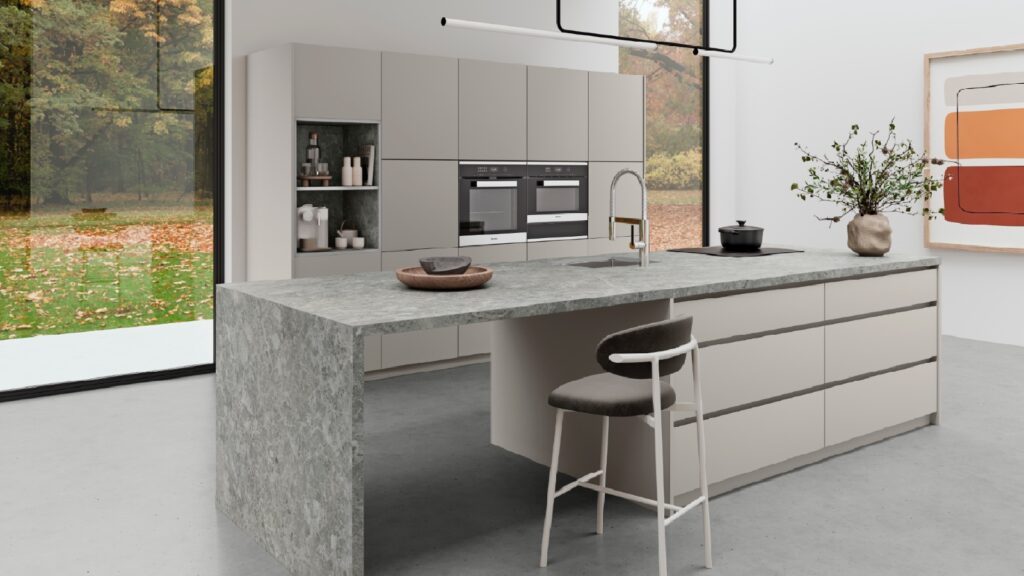
While the Cappadocia region, in central Turkey, with its rock formations formed by volcanoes and underground cities, has inspired Cappadocia Sunset (pictured below).

Just like all of Neolith’s surfaces, Calacatta Roma and Cappadocia Sunset are resistant to heat and atmospheric conditions, are 100% recyclable, and do not contain added quartz to their formulation.
Mar 14, 2024
JUST OUT: @AcquabellaBath has unveiled a choice of shower grate patterns for its Base and Arq shower trays… https://t.co/kMN83c40Qf
JUST OUT: @FrankeUK unveils Mythos single lever mixers in Swivel Spout and Pull-out Nozzle options. #kitchendesign https://t.co/TSKCAo5r0e
INTERVIEW: Sales and marketing director of @blumuk David Sanders on how the kitchen industry has changed post-pand… https://t.co/k9LIpUhhDF
NEWS: Challenging housing market is driving home improvements, finds new research by @HafeleUK #HomeImprovement… https://t.co/eMB7jludIm
NEWS: British manufacturer @kudosshowersltd acquired by European SanSwiss. #acquisition #manufacturers #bathrooms https://t.co/gpOv7jMevn
NEWS: @HafeleUK announces Richard Curtis as managing director. #newhire #appointment #leadership https://t.co/NP8U5ramOb
NEWS: @officialbikbbi names CT1 sealant manufacturer as corporate sponsor. #installation #installer https://t.co/8zsxs2HI3n
NEWS: @quookeruk named one of fastest-growing companies in North West. #business #Awards https://t.co/9zZ1ZDGrFI
RETAILER FOCUS: Managing director and design director of UK Kitchen Retailer of the Year @KitchensbyJSG Jim Geddes… https://t.co/JhL3vmxwbd
NEWS: Consumers are renovating for long term, with kitchens and bathrooms a priority, finds @HouzzUK… https://t.co/9VhoTUDI0B
PROFILE: Managing Director of Flair Showers Alan Wright talks about the relaunch of the company, creation of a Show… https://t.co/WDMPqDt2Uk
The new @blumuk carbon black LEGRABOX boasts beautifully slim drawer sides, bringing furniture onto trend, easily b… https://t.co/DrEXXWTyQb
NEWS: House of Fraser owner @FrasersGroupPLC enters strategic partnership with @ao, buying a stake in the online e… https://t.co/44N0O9bekn
NEWS: @HowdensJoinery awarded @WhichUK Best Buy for its rigid cabinets and handleless kitchens. #kitchen… https://t.co/rALz8XRHbv
NEWS: @grohe invites 800 guests from around the world to its Grohe X Professional event in Lisbon, Portugal.… https://t.co/2RGjDum980
JUST OUT: Home appliance brand Candy has unveiled the Rapido dishwasher, claimed to be the fastest and most spaciou… https://t.co/mbWn2pJp2C
Newsletter
Sign up to receive our newsletter and we’ll send you details of our latest videos, competitions and much more

