Projects | Chic Shaker kitchen for period townhouse
Senior kitchen designer at deVOL Hannah Vincent explains how she improved the connection between the kitchen and adjacent spaces, with this chic Shaker.
Senior kitchen designer at deVOL Hannah Vincent explains how she improved the connection with adjacent spaces in a period home, with this chic Shaker
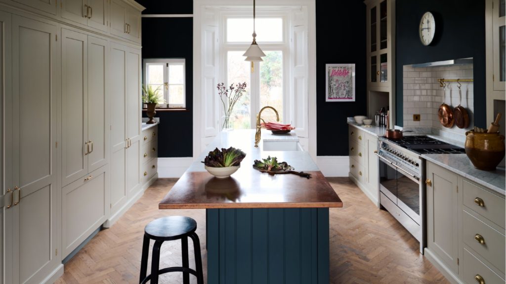
In a Victorian townhouse, just a stone’s throw from the River Thames, Hannah Vincent used the features of the building to create a chic Shaker kitchen, which connected with adjacent dining room.
She explains: “Our customers had recently moved into their period home and were keen to replace their kitchen and improve the relationship between their dining room.
Sponsored Video
“The two rooms had gorgeous, existing period features with high ceilings, decorative cornice and original shutters, which were being overshadowed by early 00’s fitted furniture.
“It was particularly important to not only create a design that worked with these features but that would accentuate them.”
Storage space
In addition, the owners also wanted to include a list of appliances along with full-height cupboards, so Hannah studied the layout, as she explained the original kitchen didn’t make the best use of the space.
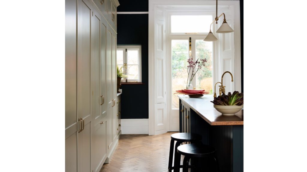
She continues: “At some point in the building’s history, the existing chimney breast had been blocked up in the kitchen to make way for a full height, stepped run of units. The owners had always planned to reopen this and create a focal point.”
This was the only major structural change and Hannah explains it was import to help create the new space.
“It helped to create the perfect canvas, and provided the space we needed for a timeless, practical kitchen for their family with ample storage and integrated appliances. whilst being sympathetic to the style and period of the house”, she sayd.
Online inspiration
The customer had researched the company online, and were enamoured with the Frome Kitchen on its website, characterised by lofty ceilings and showstopping countertop cabinets.
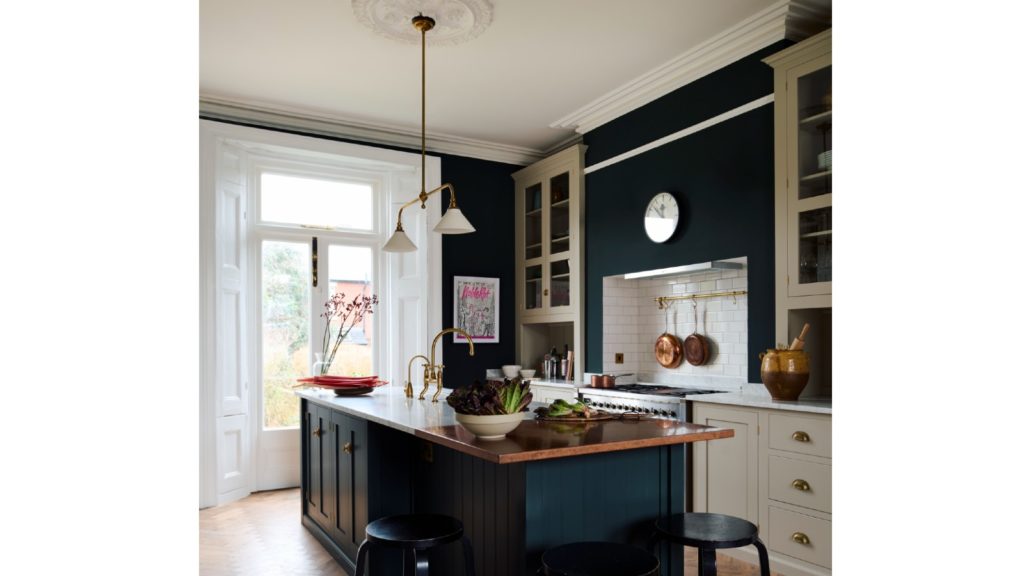
Hannah explains it provided her with a “fantastic” aesthetic starting point, as it was very similar to the real-life space.
However, she explains it was important that the design was not a replica copy of the marketing image, adding: “Whilst keeping this project in mind from our first design through to our last, it was key that the design reflected the owner’s needs and personality, and for their kitchen to feel like their own and not just a like-for-like copy.”
Presenting her ideas, Hannah adds: “The owners were fantastic to work with and we nailed down their ideal design pretty early on, this meant that we were able to use the rest of our time together honing in on the details that would make their kitchen stand-out whilst keeping to their budget.”
Bring within budget
To ensure the kitchen fell within budget, Hannah chose to mix two of the company’s handmade kitchen ranges.
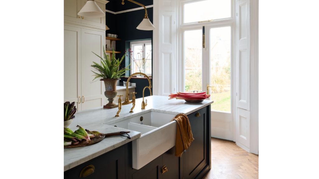
She used modular Real Shaker range for a simple and elegant base, and its Classic English range of furniture for special, bespoke pieces.
She continues: “As with all renovations it was essential to stick to the budget, or even under where possible.
“By mixing two furniture ranges, we were able to take advantage of our cost-effective Real Shaker kitchen furniture which left room in the budget to get creative with a few carefully selected pieces of our Classic English furniture.”
Garden views
So what was Hannah particularly pleased with about the design? “I love that the owners are able to sit at their island and look out onto their beautiful garden. This vista was enhanced through the choice of “Bakehouse Green” on the kitchen walls.
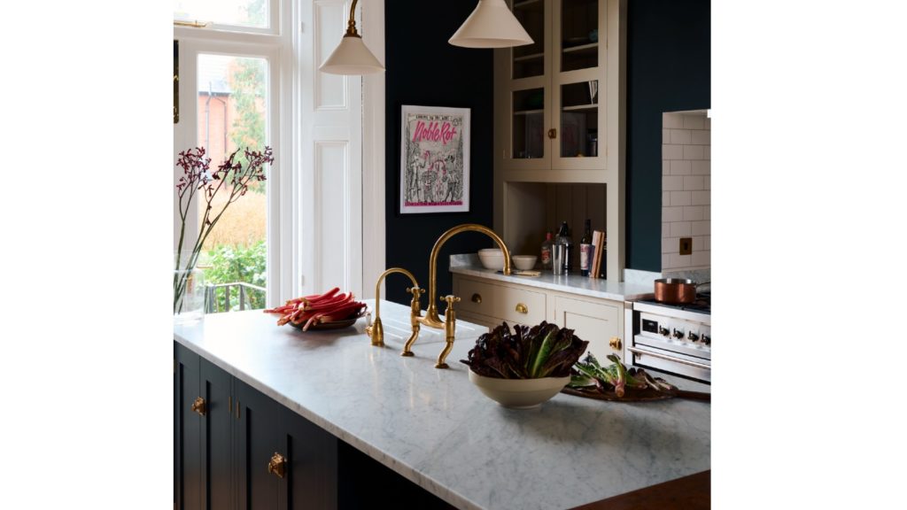
“At the time, this shade was a new addition to our line-up and it was a real first to see it used on the walls in such a dramatic way.
“The juxtaposition between this colour and the crisp cornicing further highlights the original features and completes the transformation.”
Related Articles
#socialwall
Sintered stone manufacturer Neolith has launched Calacatta Roma and Cappadocia Sunset, inspired by nature and classical architecture, and for use in kitchens or bathrooms walls, floors, in gardens or facades.
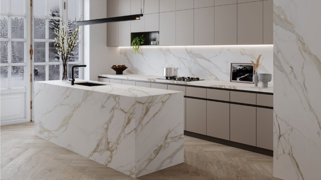
They belong to The New Classtone and Fusioncollections which interpret marble and natural stone, respectively, and boast Neolith’s antibacterial NeolEAT technology.
Inspired by Ancient Rome, Calacatta Roma (pictured top) pays homage to Italian Carrara marble, with ochre and grey veins in a white background.
While the Cappadocia region, in central Turkey, with its rock formations formed by volcanoes and underground cities, has inspired Cappadocia Sunset (pictured below).
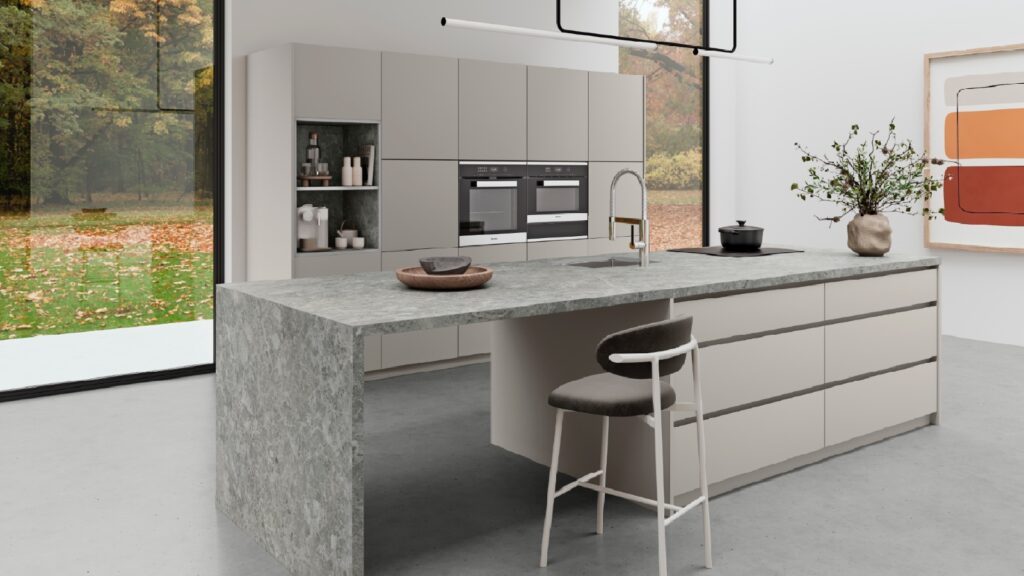
Just like all of Neolith’s surfaces, Calacatta Roma and Cappadocia Sunset are resistant to heat and atmospheric conditions, are 100% recyclable, and do not contain added quartz to their formulation.
Mar 14, 2024
JUST OUT: @AcquabellaBath has unveiled a choice of shower grate patterns for its Base and Arq shower trays… https://t.co/kMN83c40Qf
JUST OUT: @FrankeUK unveils Mythos single lever mixers in Swivel Spout and Pull-out Nozzle options. #kitchendesign https://t.co/TSKCAo5r0e
INTERVIEW: Sales and marketing director of @blumuk David Sanders on how the kitchen industry has changed post-pand… https://t.co/k9LIpUhhDF
NEWS: Challenging housing market is driving home improvements, finds new research by @HafeleUK #HomeImprovement… https://t.co/eMB7jludIm
NEWS: British manufacturer @kudosshowersltd acquired by European SanSwiss. #acquisition #manufacturers #bathrooms https://t.co/gpOv7jMevn
NEWS: @HafeleUK announces Richard Curtis as managing director. #newhire #appointment #leadership https://t.co/NP8U5ramOb
NEWS: @officialbikbbi names CT1 sealant manufacturer as corporate sponsor. #installation #installer https://t.co/8zsxs2HI3n
NEWS: @quookeruk named one of fastest-growing companies in North West. #business #Awards https://t.co/9zZ1ZDGrFI
RETAILER FOCUS: Managing director and design director of UK Kitchen Retailer of the Year @KitchensbyJSG Jim Geddes… https://t.co/JhL3vmxwbd
NEWS: Consumers are renovating for long term, with kitchens and bathrooms a priority, finds @HouzzUK… https://t.co/9VhoTUDI0B
PROFILE: Managing Director of Flair Showers Alan Wright talks about the relaunch of the company, creation of a Show… https://t.co/WDMPqDt2Uk
The new @blumuk carbon black LEGRABOX boasts beautifully slim drawer sides, bringing furniture onto trend, easily b… https://t.co/DrEXXWTyQb
NEWS: House of Fraser owner @FrasersGroupPLC enters strategic partnership with @ao, buying a stake in the online e… https://t.co/44N0O9bekn
NEWS: @HowdensJoinery awarded @WhichUK Best Buy for its rigid cabinets and handleless kitchens. #kitchen… https://t.co/rALz8XRHbv
NEWS: @grohe invites 800 guests from around the world to its Grohe X Professional event in Lisbon, Portugal.… https://t.co/2RGjDum980
JUST OUT: Home appliance brand Candy has unveiled the Rapido dishwasher, claimed to be the fastest and most spaciou… https://t.co/mbWn2pJp2C
Newsletter
Sign up to receive our newsletter and we’ll send you details of our latest videos, competitions and much more

