Projects | Kitchen extension with geometric glass roof
Senior designer of The Main Company Julia Dale collaborated with StudioDH architects on this kitchen for an extension beneath a geometric roof design.
Senior designer of The Main Company Julia Dale collaborated with StudioDH architects on this kitchen for an extension beneath a geometric roof design.
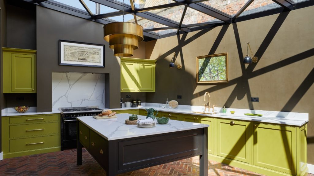
Located in the city of York, and created for a Victorian property with modern extension, is this eye-catching green project which blends style function and opulence.
The clients, a couple with no children, wanted a space that embodied sophistication while offering plenty of practical space, allowing more room for cooking and entertaining.
Sponsored Video
The kitchen’s layout has been designed to include maximum storage and efficiency, alongside statement features.
Challenging storage
Senior designer Julia Dale said the greatest challenge was to incorporate enough storage but not detract from the geometric roof by adding too many wall cabinets.
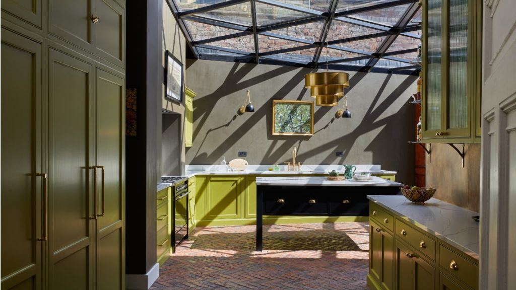
So, The Main Company decided to prioritise floor to ceiling storage in the old kitchen area and walk-through space, giving space for food and tableware, thanks to the ceiling height.
This allowed the geometric roof to take centre-stage in the main kitchen area, paired with low cabinetry, an island and a dining table.
A wall of floor to ceiling cupboards plays host to a large built-in pantry as well as plenty of drawer space for pots, pans and cooking utensils.
Home bar feature
With the homeowners appreciating the finer things in life, the eye-catching features include artwork above the sink and hob, as well as an impressive home bar.
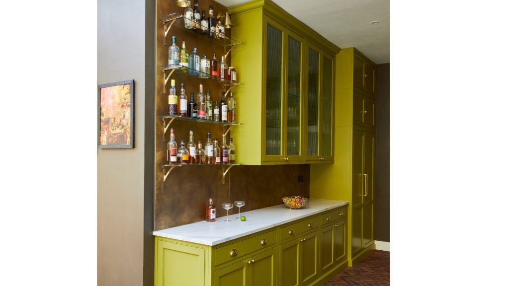
The aged brass splashback, adorned with floating shelves, provides a backdrop for their extensive collection of wines and spirits, creating a focal point for guests to admire – without taking attention away from other areas of the kitchen.
It was an area of the kitchen, senior designer Julia Dale was particularly pleased with: “The stylish bar area which ties in beautifully with the rest of the kitchen, but stands out on its own!
“A patina aged brass splash back has been added between floating glass shelves which display the clients liquor.
“The result is a striking feature wall which adds layer and depth to the kitchen, creating a specific zone for the homeowners and guests to enjoy cocktails whilst still being part of the kitchen.
Green and black palette
Combining a palette of greens and blacks, the L-shaped kitchen’s dark colour palette is bathed in natural light from the glass roof, which casts shadows across the space which move throughout the day.
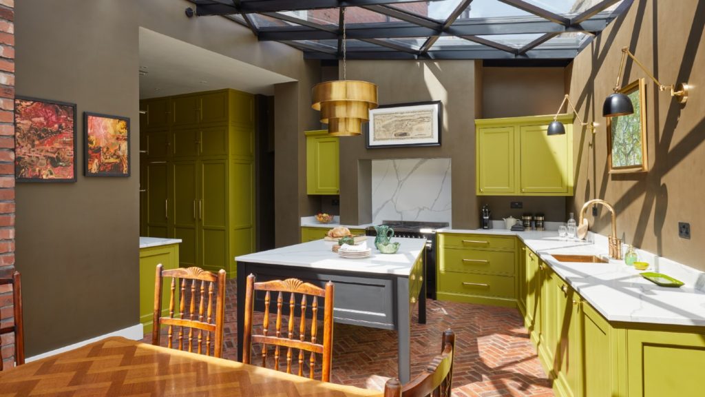
The warm undertones of Little Greene’s ‘Citrine’ adorns the cabinets, paired with elegant brushed gold hardware from Heritage Brass.
The fresh, vibrant olive green pops against the moss-coloured walls and Little Green ‘Jack Black’ black kitchen island in the centre.
It helps draw the eye in to the kitchen extension and complements the colours of the industrial roof.
Completing the look is a white, veined quartz worktops chosen for its durability and ability to be easy-to-clean allowing a seamless space for food preparation and cooking.
The owners wanted to incorporate the Citrine green colour into the kitchen cabinets, while keeping with the traditional kitchen aesthetic – and left the designer to choose the rest.
Julia Dales adds: “They loved how the colour was used throughout and complemented the rest of the earthy palette and other textures in the space.”
Pairing old and new to complement both the history of the home and the contemporary feel of the extension, from the classic shaker cabinetry and terracotta brick floor tiles to the modern black and gold, the kitchen provides the perfect backdrop for both entertaining and day-to-day living.
Related Articles
#socialwall
Sintered stone manufacturer Neolith has launched Calacatta Roma and Cappadocia Sunset, inspired by nature and classical architecture, and for use in kitchens or bathrooms walls, floors, in gardens or facades.
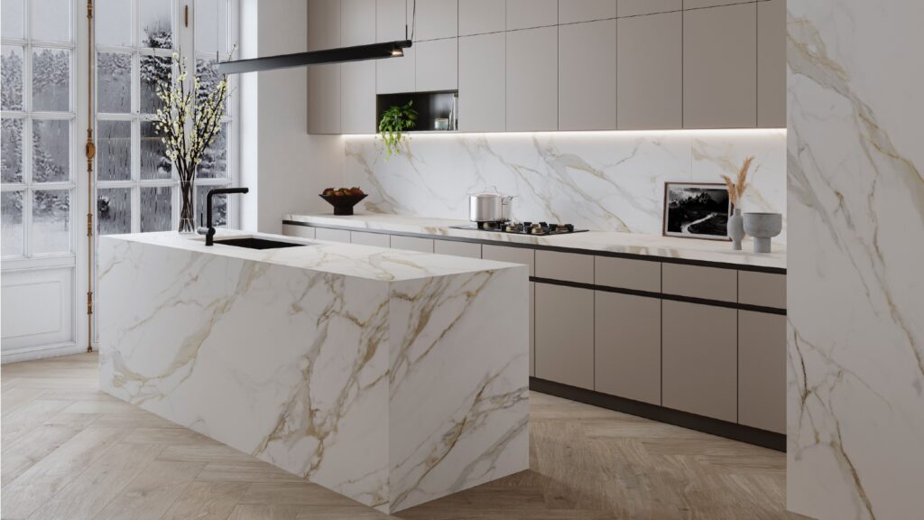
They belong to The New Classtone and Fusioncollections which interpret marble and natural stone, respectively, and boast Neolith’s antibacterial NeolEAT technology.
Inspired by Ancient Rome, Calacatta Roma (pictured top) pays homage to Italian Carrara marble, with ochre and grey veins in a white background.
While the Cappadocia region, in central Turkey, with its rock formations formed by volcanoes and underground cities, has inspired Cappadocia Sunset (pictured below).
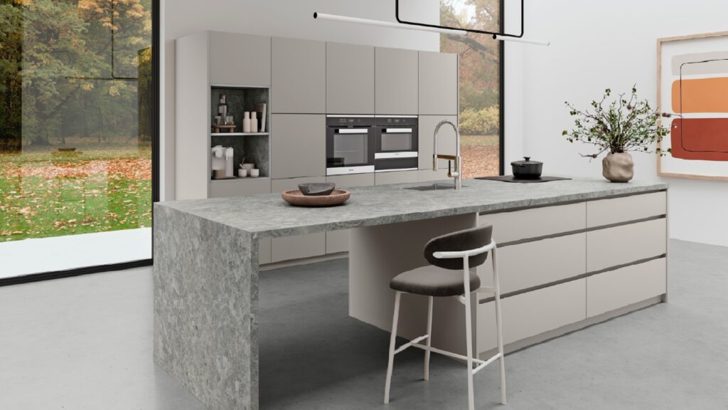
Just like all of Neolith’s surfaces, Calacatta Roma and Cappadocia Sunset are resistant to heat and atmospheric conditions, are 100% recyclable, and do not contain added quartz to their formulation.
Mar 14, 2024
JUST OUT: @AcquabellaBath has unveiled a choice of shower grate patterns for its Base and Arq shower trays… https://t.co/kMN83c40Qf
JUST OUT: @FrankeUK unveils Mythos single lever mixers in Swivel Spout and Pull-out Nozzle options. #kitchendesign https://t.co/TSKCAo5r0e
INTERVIEW: Sales and marketing director of @blumuk David Sanders on how the kitchen industry has changed post-pand… https://t.co/k9LIpUhhDF
NEWS: Challenging housing market is driving home improvements, finds new research by @HafeleUK #HomeImprovement… https://t.co/eMB7jludIm
NEWS: British manufacturer @kudosshowersltd acquired by European SanSwiss. #acquisition #manufacturers #bathrooms https://t.co/gpOv7jMevn
NEWS: @HafeleUK announces Richard Curtis as managing director. #newhire #appointment #leadership https://t.co/NP8U5ramOb
NEWS: @officialbikbbi names CT1 sealant manufacturer as corporate sponsor. #installation #installer https://t.co/8zsxs2HI3n
NEWS: @quookeruk named one of fastest-growing companies in North West. #business #Awards https://t.co/9zZ1ZDGrFI
RETAILER FOCUS: Managing director and design director of UK Kitchen Retailer of the Year @KitchensbyJSG Jim Geddes… https://t.co/JhL3vmxwbd
NEWS: Consumers are renovating for long term, with kitchens and bathrooms a priority, finds @HouzzUK… https://t.co/9VhoTUDI0B
PROFILE: Managing Director of Flair Showers Alan Wright talks about the relaunch of the company, creation of a Show… https://t.co/WDMPqDt2Uk
The new @blumuk carbon black LEGRABOX boasts beautifully slim drawer sides, bringing furniture onto trend, easily b… https://t.co/DrEXXWTyQb
NEWS: House of Fraser owner @FrasersGroupPLC enters strategic partnership with @ao, buying a stake in the online e… https://t.co/44N0O9bekn
NEWS: @HowdensJoinery awarded @WhichUK Best Buy for its rigid cabinets and handleless kitchens. #kitchen… https://t.co/rALz8XRHbv
NEWS: @grohe invites 800 guests from around the world to its Grohe X Professional event in Lisbon, Portugal.… https://t.co/2RGjDum980
JUST OUT: Home appliance brand Candy has unveiled the Rapido dishwasher, claimed to be the fastest and most spaciou… https://t.co/mbWn2pJp2C
Newsletter
Sign up to receive our newsletter and we’ll send you details of our latest videos, competitions and much more

